
Get your Black Friday fix at Framing Grace Gallery! There will be a welcome reception tomorrow evening for recently arrived to Provo oil painter Charlotte Readhead in addition to new work from many resident gallery artists. I will be debuting my first sculpture series; “Drift”:

Drift No. 4 base 6″dia x 37″h

Drift No. 1 base 6″ dia x 21″h

Drift No. 2 base 6″dia x 27″h

Drift No. 3 base 6″ x 29″h

Drift No. 5 base 5″dia x 16″h

Drift No. 6 base 5″dia x 20″h

Drift No. 7 base 6″ dia x 41″h
I also have a hot off the press abstract waterscape painting that will be shown for the first time in public (pictured below). Please join us from 6-8pm for martinis, meet the artists, and holiday cheer! The Regent Village will be aglow with holiday lights and Flowers by Environmental Arts will have open doors for the celebration so there will be plenty of lovely around to look at! We hope to see you there!

Waterscape 36″w x 50″h x 3″d

UPDATE!
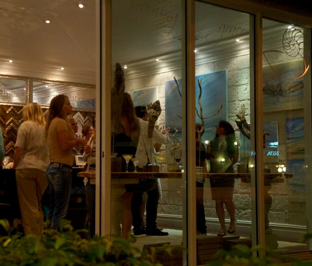
A few images from the evening!

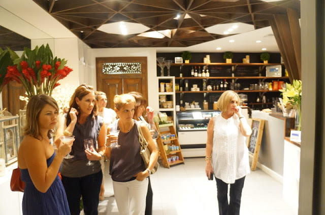
Neighboring Environmental Arts Flower Shop filled with goodies and heavenly scents for the holidays.

The gallery reception was even better attended than expected, there were moments when crossing the room simply wasn’t an option! So nice to have so many people come out in support of our local art community, the room was absolutely abuzz with conversation.

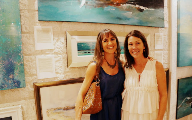
Many thanks to all my friends who came to show their support!

Congratulations to Joelle and Neil on their beautiful new space and wonderful location in the Regent Village and many thanks for hosting such a great evening at the gallery!


